Redesigning a responsive alcohol website to better align with user wants and needs
The Project Process
Role: Sole Designer
Timeline: 4 weeks
Tools: Figma
Research
Statistical Data
Competitive Analysis
User Interviews
Define
Affinity Mapping
User Personas
User Flows
Design
Low-Fidelity Wireframes
Branding
High-Fidelity Wireframes
Test
Prototyping
Usability Testing
Problem
Local Roots Kombucha’s website has a handful of usability issues
On top of a large amount of whitespace that does a poor job of informing any personality or brand values of the product to the user, the main issue is the hierarchy of information presented to the user, or lack thereof.
Goal
Responsively redesign the site to better align with user wants, needs and expectations
Research
The hard kombucha market has more than tripled in the last 4 years
With 64% of millennials preferring new alcoholic beverages, such as kombucha, over conventional beer, wine and spirits. However, it is still a relatively new product to the masses, which means that the average consumer may require a bit of kombucha education before they can become a customer.
Competitive Analysis
These sites all educate the user about kombucha, as well as how they do kombucha differently
One can get an immediate sense of the kind of person who drinks each of these kombucha brands from the homepage. There is opportunity in Local Roots leaning into brand values so that a user visiting their site can get a better sense of the brand off the bat, something that is currently much to be desired.
Interview Research Goals
What would inspire someone to go to a kombucha website?
In what setting would people go to a kombucha website?
What are the most important things people want to know when on a kombucha website?
What would make people choose one kombucha brand over another?
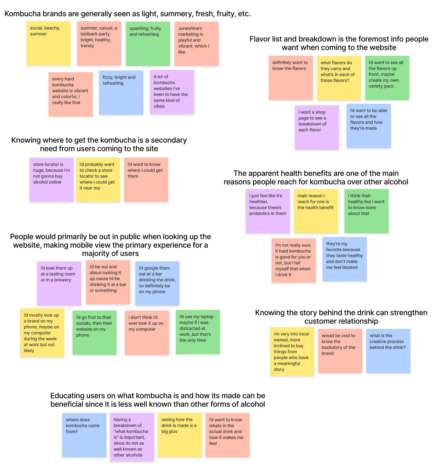
Users want to know the different flavors and what’s in them first and foremost
Learning where you can purchase them, how they’re made, and the brand’s story are all necessary, however all are secondary to flavors. A kombucha brand’s unique flavors can help them stand out amongst other brands and be the reason a customer picks them over another.
How might we offer users the information they are looking for quickly and effectively, whether they are on mobile or desktop?
Define
User Personas
The expert and the novice kombucha drinker should both be equally satisfied
These users might have different priorities in regards to what they expect out of a kombucha website. It is important to make sure both of their needs are met without hindering the experience of the other. Freddy probably doesn’t need to be educated about what kombucha is, just as Nina might not care about the brand story.
Organizing the architecture of information in a way that both these users can see the things they want without being forced to see the things they don’t ensures the best experience for each of them.
User Flows
Find your flavor and where to get it
As was found in the research, flavor selection is the key piece of info most users are looking for. Past that, since Local Roots doesn’t sell directly from their website, the necessary step to truly interact with the product would be to find out where you can get your hands on one.
Design
Low-Fidelity Wireframes
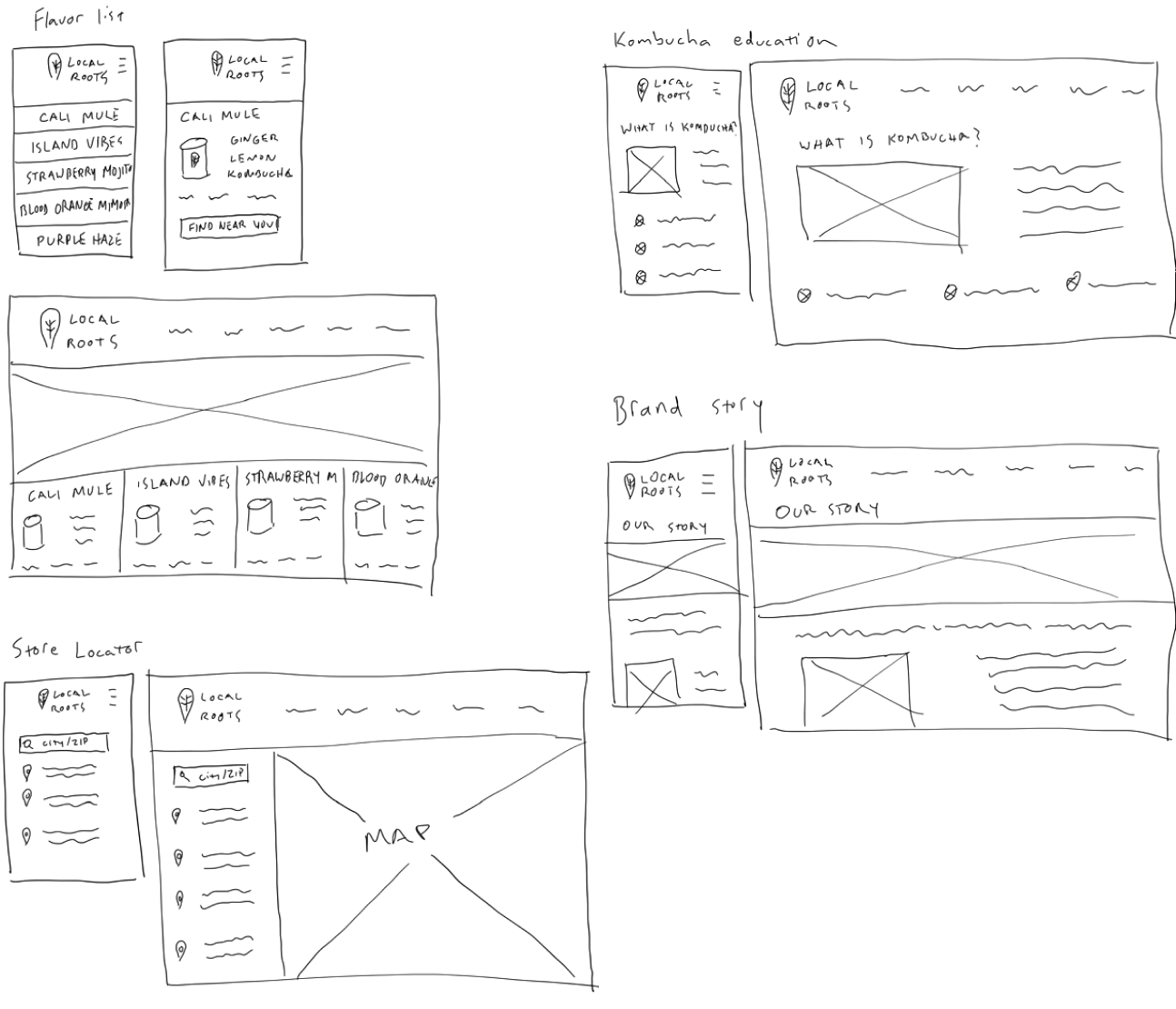
Everything accessible by two taps on mobile, one click on desktop
Since it remains the highest priority, flavor selection will be the first information presented to the user. After that, different users will have different needs, so ensuring they have equal access to whatever is necessary will ensure the best possible experience for everyone.
Branding
Color Palette
Typography
Local Roots represents a hard kombucha with natural ingredients breeding a homegrown community
Ensuring the user can feel this organic freshness and this sense of local community as they navigate the site can help them gain a better understanding of both the product and the brand.
High-Fidelity Wireframes
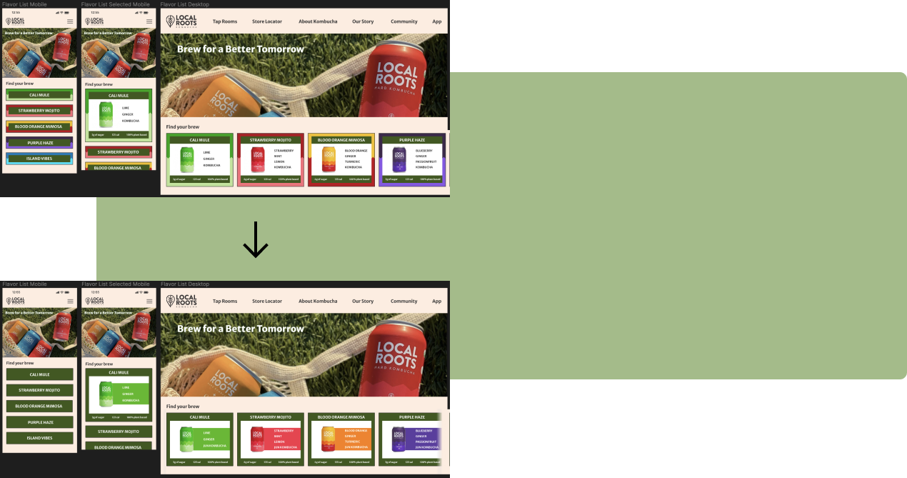
Old vs New Home Page
Listed out the flavors and ingredients for easier access to the user
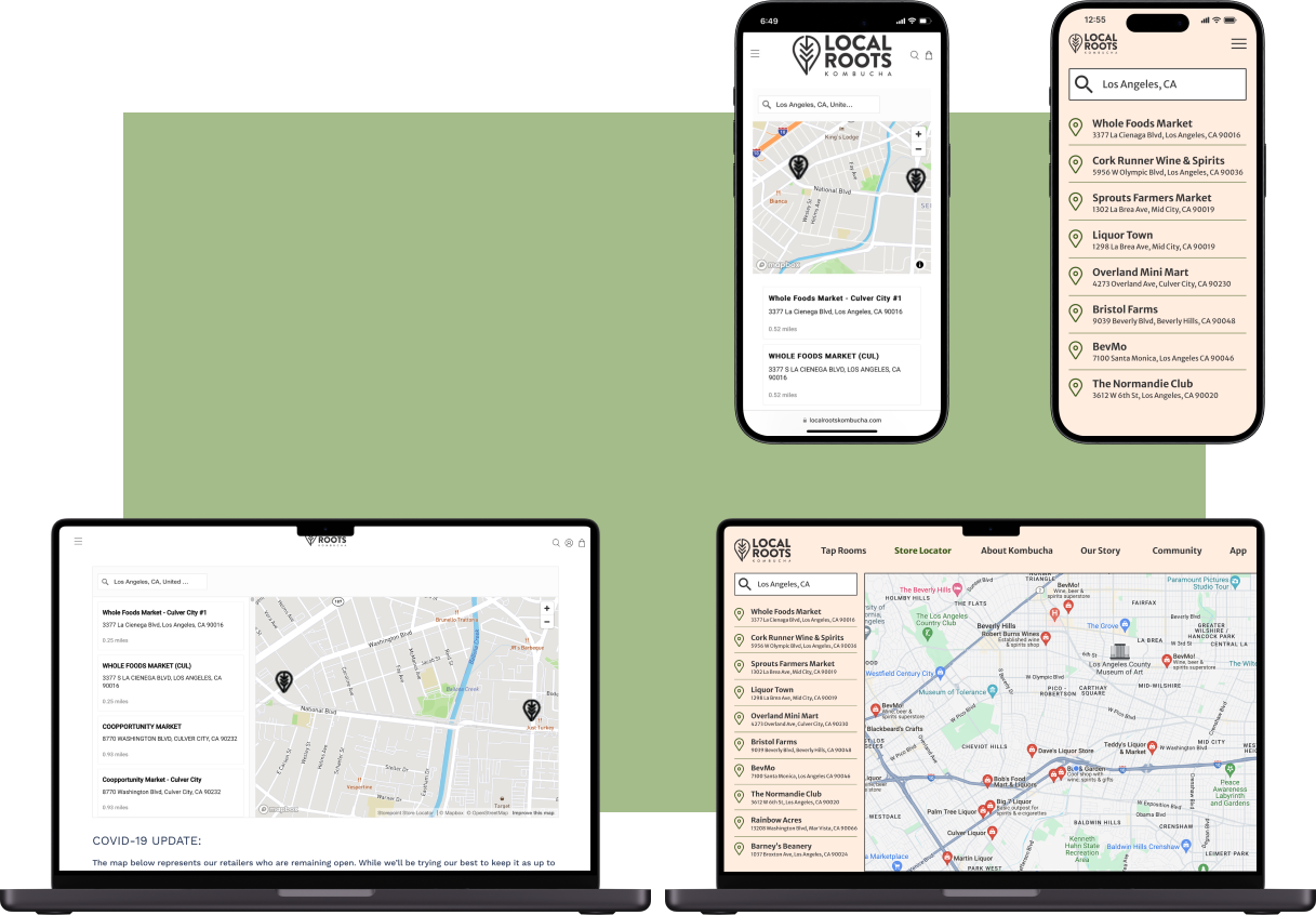
Old vs New Store Locator
Gave the page more character to better tie in with site cohesiveness
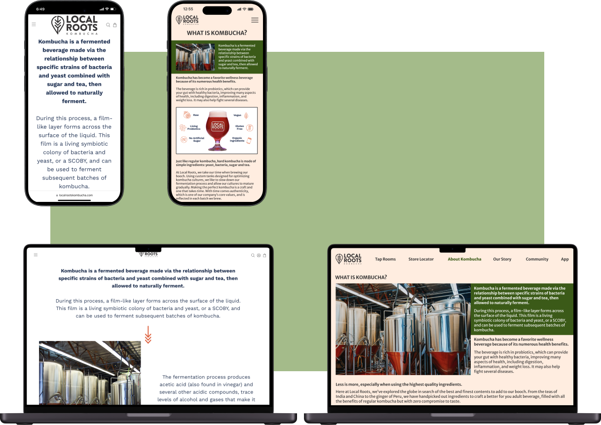
Old vs New Kombucha Education
Added more imagery to increase visual engagement with the text heavy content
Old vs New Brand Story
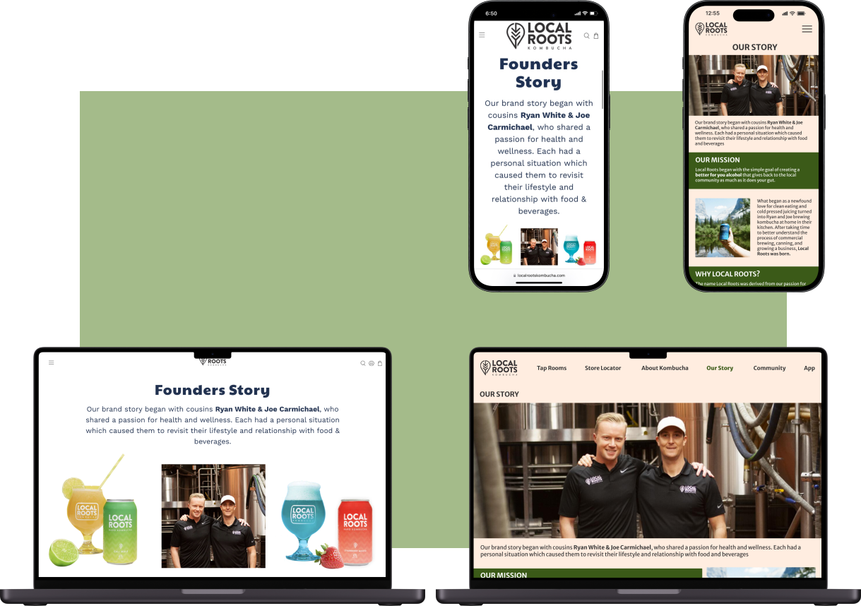
Established better visual hierarchy for important pieces like Mission Statement or Why Local Roots
Blending Local Roots’ personality with better usability can facilitate a stronger customer bond
This allows users to connect more with Local Roots and what they represent, as well as navigate their site with ease to find the information they’re looking for.
Test
Prototypes
A customer can be decided within seconds of visiting a website
Ensuring that the user finds what they are looking for and the information is where they expect it to be gives the business the best chance for turning that user into a customer.
Iterations
Based on user data and feedback from the usability tests, these were the necessary changes to improve the overall experience.
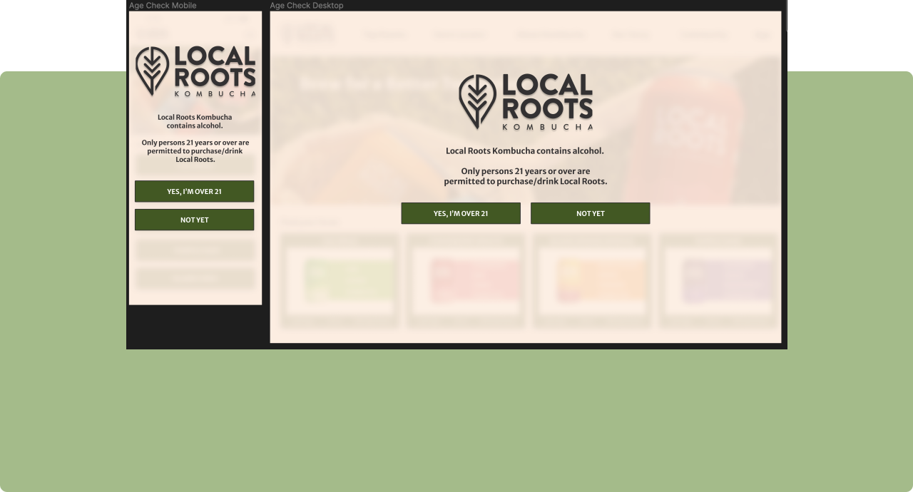
Added an age check verification to ensure users understand this is an alcoholic product. Yes gets the user into the website, no takes the user to the brand’s socials
Updated UI elements to feel more “natural and fresh” rather than “bright and exciting” to make the overall site feel more cohesive as well as better represent brand values
Added a fading cutoff to aid in a sense of more information offscreen, encouraging horizontal scrolling
Changed the kombucha benefit blurbs on “About Kombucha” to be more cohesive and more in line with responsive desktop design
Moved and resized Local Roots logo to better format a mobile viewport as well as gain slightly more screen real estate.
Conclusion
Local Roots can stand out in a rapidly growing market
Differentiating yourself from your competitors when you offer a similar product can be very difficult, so finding out that something your company values is something the market is missing in terms of representation is gold. Creating this natural, fresh, local community driven design will help users connect more deeply with Local Roots and ensure they are on the right path as the kombucha market continues to grow.
This project presented me with a major self confidence roadblock in my blossoming skills as a UX designer. I lost sight of the things I had learned and began to focus on all the things I have yet to learn, spiraling my confidence down. I was being hypercritical of my creative work and not letting myself commit to the iterative process, failing to realize that finding a design that works only comes after trying things that don’t work.
If I were to do this project again, I would commit more time to gathering user research, so that design decisions could be made much easier knowing they are data driven. I would also commit myself to the iterative process, knowing that before the aha moment strikes, there is a trough of unsuccessful attempts to get through.


